PurpleMay Daily
•
PurpleMay Daily •
Ongoing Visual Design & Execution
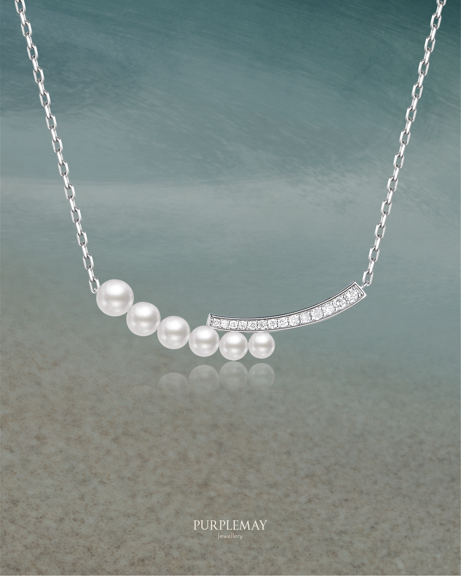
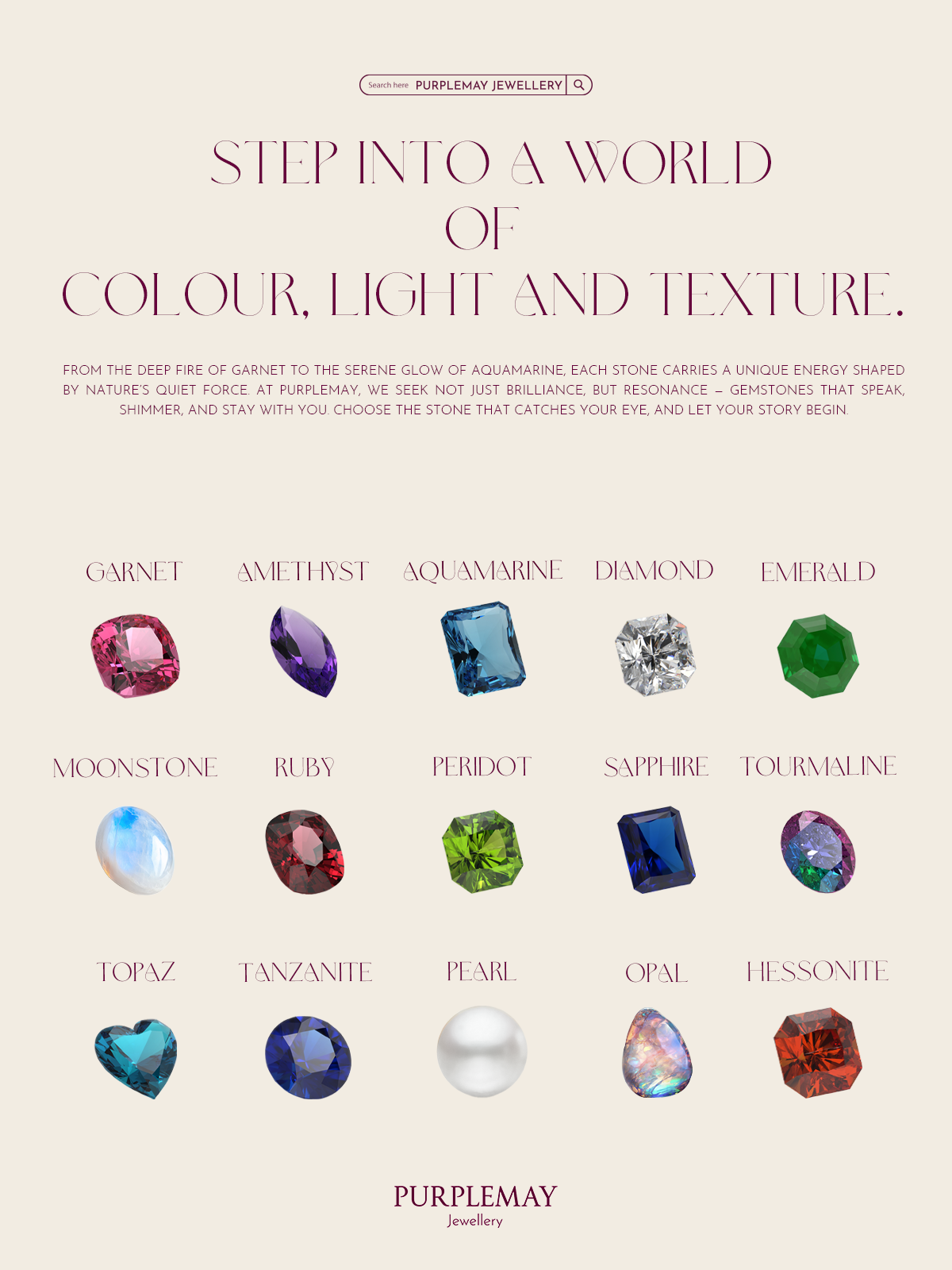
Beyond the brand identity upgrade, PurpleMay required continuous creative output to support its operations, campaigns, and customer engagement. This body of work reflects the full spectrum of design responsibilities handled during the role, covering digital, print, photography, product-related design, and brand collateral.


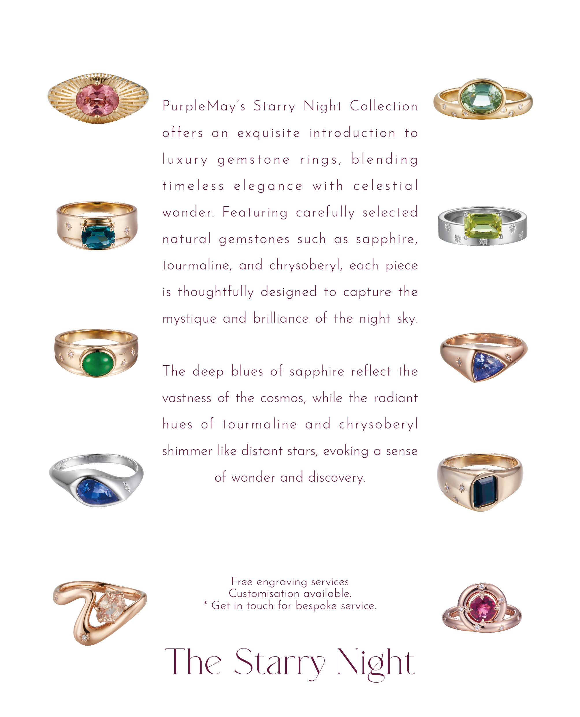


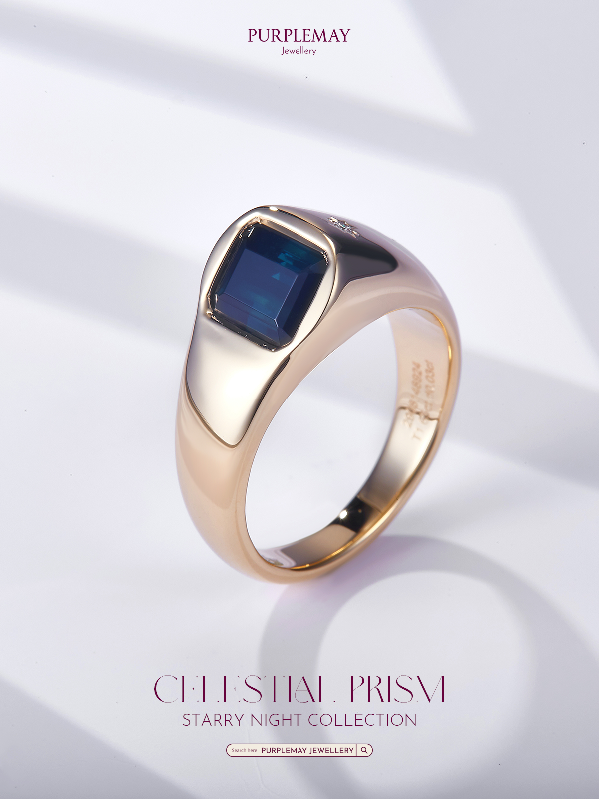


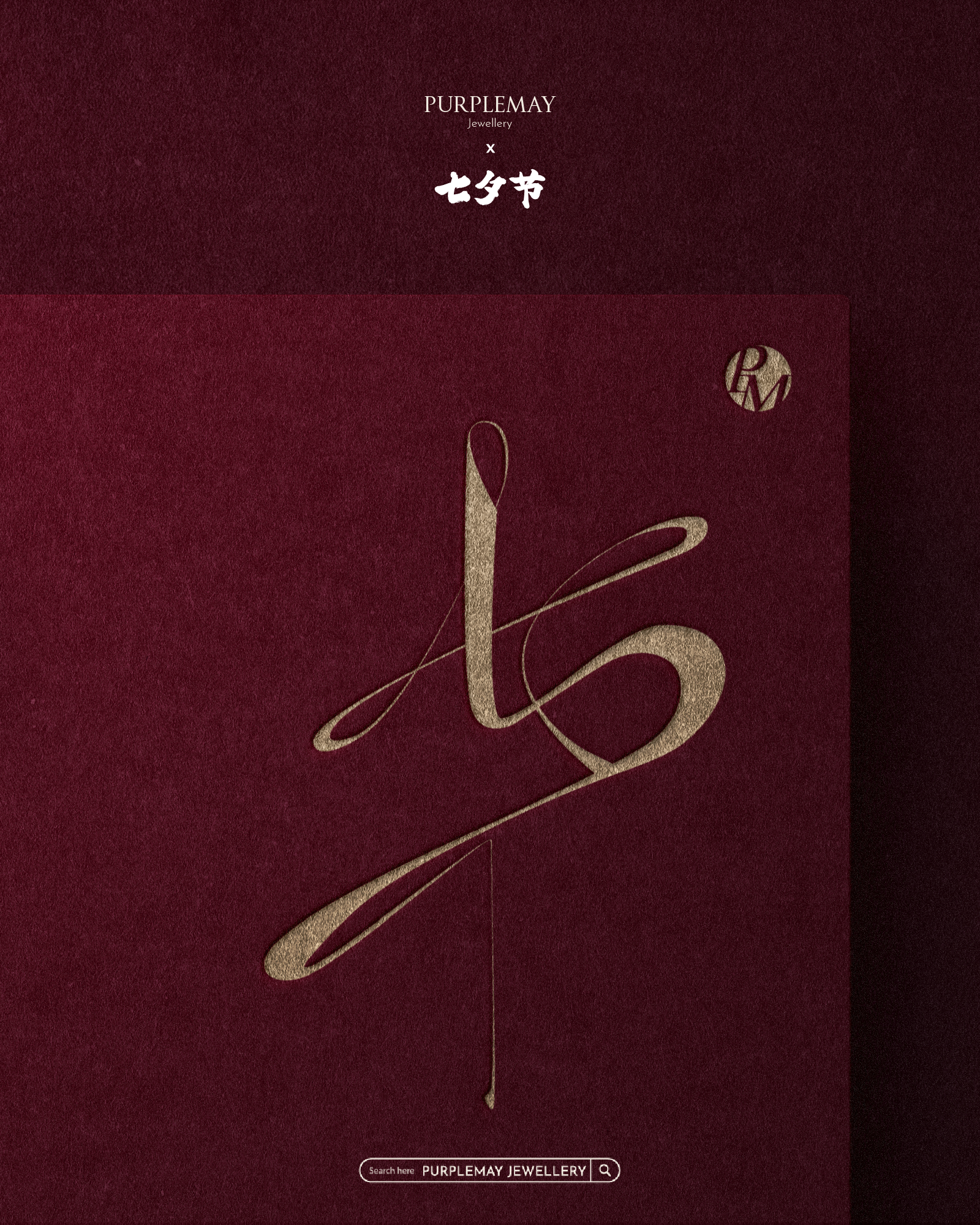


In design, precision and clean typography do more than create visual harmony—they establish trust, authority, and clarity. For a fine jewellery brand like PurpleMay, every detail in alignment, spacing, and hierarchy contributes to how the brand is perceived: refined, consistent, and timeless.
Drawing on contemporary design principles, the visual language emphasises minimalism with warmth, typographic accuracy, and editorial-inspired layouts. This approach reduces visual noise while amplifying elegance, ensuring that each piece of communication resonates with both modern design standards and brand values.
Within PurpleMay’s visual identity system, this philosophy has been applied to a variety of formal brand materials, including jewellery certificates, corporate stationery, and wedding vow books. Each item was carefully designed to balance functionality with emotion—projecting professionalism in certificates, authority in stationery, and a sense of intimacy and ceremony in vow books.
Through these details, everyday brand assets become more than functional documents; they transform into subtle yet powerful extensions of PurpleMay’s identity.


